Employers are looking carefully at how color in the workplace can drive behavior and emotion.
Science has long shown how color can significantly impact us on a psychological and behavioral level. It’s only recently that employers are fully embracing it as a way to bring calm, boost alertness and drive productivity and socialization in the office.
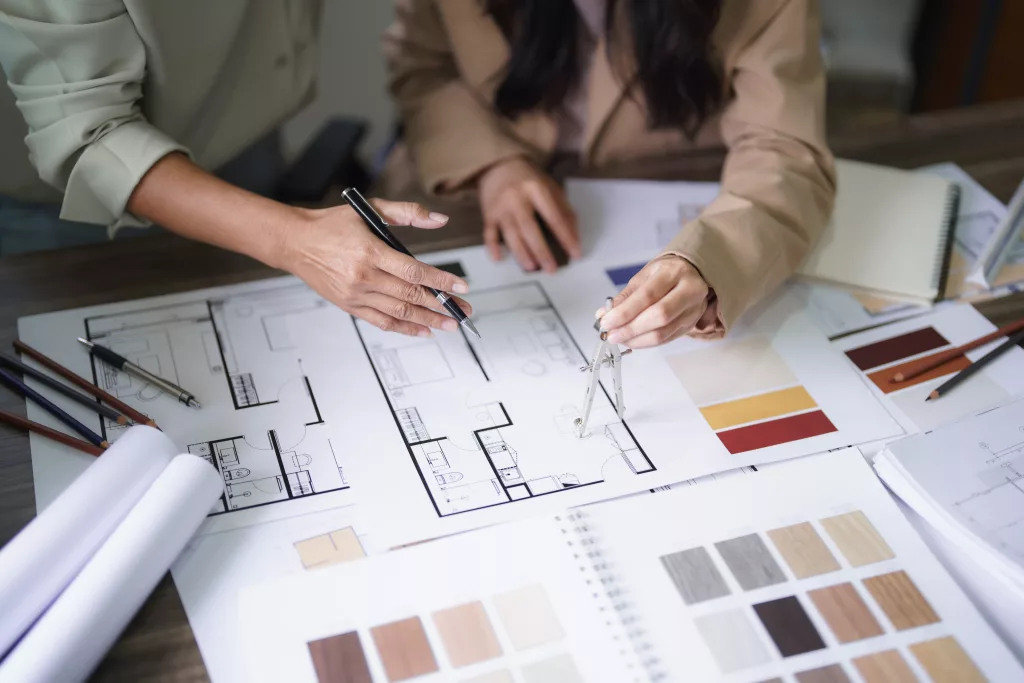
“It’s something that interior designers have been studying forever but there’s more awareness about the research today that goes outside the design world,” says Kelly Jahn, an interior designer who teaches about color psychology at Rochester Institute of Technology.
This marks a shift from the pre-pandemic workplace, in which companies focused on colors in terms of their brand. The office back then was viewed as a marketing tool and color was designed to appeal to visitors.
—AdobeStock
Then, following the pandemic, employers began looking at how color could give people a sense of safety, health and wellness and draw people back to the office. This included a lot of nature-based colors, such as blues, browns and greens.
Leaning in to Color
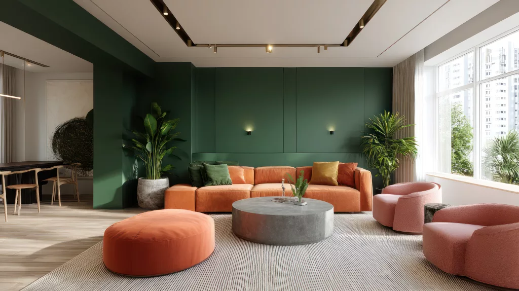
Today, leaders are doubling down on the psychology of color, using it to drive behavior in various parts of the workplace. A warm energetic orange might foster social connection. A vibrant saturated blue might be great for a focus space.
Instead of using color to speak to outsiders, leaders are using it to communicate the ethos of a company, or the internal brand of a company. They want people to enjoy being in the spaces, feel comfortable and trust.
And, because less heads down work is being done at the office, there’s a shift to using more saturated, bolder colors like reds and oranges that increase energy and engage awareness—perfect for collaborative spaces. Younger designers and leaders, in particular, tend to gravitate toward those bolder, more saturated colors. “They are bold, maximalists,” says Jahn.
Research found that saturated hues can change our respiration, blood pressure and body temperature. The study found that people inside pale-blue or pale-yellow rooms had lower heart rates and were more relaxed; those in vivid yellow and blue rooms had higher reading comprehension.
Color to boost connection, reflection, brainstorming
Research by MillerKnoll found that cool blues are ideal in group meeting spaces, sage greens boost reflection, and oranges and yellows help foster socialization. Community spaces should have both warm and cool colors to encourage diverse thinking. The research also found that focus rooms should avoid red because it harms analytical thinking.
Designers are also playing with monochrome rooms where the walls, ceilings and floor are similar colors. The idea: fuel brainstorming and stimulate thought. Some say that this kind of “color drenching” can reduce inhibitions and improve productivity, says Leatrice Eiseman, executive director of the Pantone Color Institute, which picks the color of the year that tends to bleed into design and fashion too.
One of her recent clients strayed from the traditional designs of wood, white wall and minimal color that has been a hallmark of law firms for decades, and instead this law firm added accents of bright orange—including a wall behind the reception desk and seat fabric in a conference room.
Color is even being used to exude power and hierarchy in some businesses. Think: black ceilings and flashes of gold inside c-suite offices that reflect the current political environment and create a sense of foreboding and exclusivity.
How we perceive color
It’s difficult to talk about color in isolation, however, because the way that color is perceived depends on the lighting—natural or artificial—as well as the object and the texture of the object. A shiny surface, for instance, will reflect color more than a rough texture. Even the person’s memory, culture and experiences will influence that perception, says Jahn.
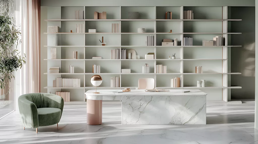
Designers are taking into account other factors when looking at how design makes people feel inside a space. They’re carefully considering the visual complexity of a space. Too little can feel stark and uninviting. Too much can be overwhelming. A moderate amount of complexity– blending a number of colors, patterns and shapes can be balancing.
Designers are looking at how layout and shapes can impact how we feel in a room too. A square or rectilinear room feels better, for instance, than a round room. Softer, warmer lighting feels more relaxed, while cooler lighting feels energizing. Visible wood grain and softer fabrics feel calming.
A lot of the on-trend colors out of the NeoCon design conference this spring were the muted jewel tones that were popular in the 70s. The salmons, the mustard yellows and olive greens. Yet instead of just jumping on trends, employers are thinking about how these colors make people feel. Because color isn’t just about what’s on the walls, it’s about what’s in the minds of the people who work there.